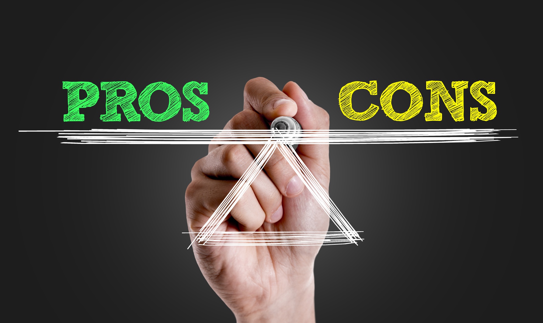
Landing pages are a big part of your inbound marketing strategy, and the intention behind them is to convert visitors into leads. While you have to test to find out for sure what your visitors will respond to, many lead-gen experts recommend a few landing page design tips that may help to improve your response rates.
Get and Keep Attention with Your Landing Page Design
It’s a world of short attention spans. When prospects land on your page, you have a matter of seconds to capture their attention and get them to keep reading. While it’s important to start with a compelling headline, the structure of the words on the page matter too.
The most important elements of your landing page should be placed “above the fold” which is a concept that originated in the newspaper industry. It simply means the space that would appear above the fold of a newspaper. In other words, your most important information needs to be communicated toward the top of the page before you lose their attention.
A Simple Uncluttered Design
You might be tempted to use a lot of graphics, but this actually distracts visitors from absorbing your message. It can also cause your landing page to load too slowly. Any images you do choose should support your message, not distract from it.
In the online space, people are usually scanning, not reading. They are looking quickly at your page to see if the info they are seeking is there somewhere. Use easy-to-scan bullet points and clear headers and sub-headers.
The Importance of White Space
White space is any part of a web page that is not marked, such as the space between text, columns, margins, graphics and other page elements. The use of white space is deliberate. It allows other aspects of a landing page to look more pronounced so that you are able to draw attention exactly where you want it.
By using white space, your text is decluttered and your page visitor can have a better reading experience. A page with a generous amount of white space guides the readers’ eyes to the primary message of the page.
Your Call to Action
When designing a landing page, you want to make sure that your call to action can’t be missed. If you are trying to get prospects to fill out a form and click submit, one of the best ways to accomplish that is by using contrasting and complementary colors. This makes it very easy for visitors to know what action you want them to take.
Your call to action button text should be clear and specific. It’s an instruction to your landing page visitors on what to do next. The color of the call to action button should be noticeable, contrasting with the other colors on the page.
Improving Your Landing Page Design
The design of your landing page may have more impact on your conversion rates than you realize. The experts at Softline Solutions can help you to improve the appearance of your landing pages so that you can obtain better results. Contact us today for more information.